For details of the outfit: scroll down.
The trend to mix different patterns is still hot this fall, but new for this season is that all old rules are put aside. This trend was obvious at Fashion Week Stockholm where different colors was mixed with various patterns and fabrics.
The trend mixing different patterns has also found its place at the office, but with a more modest and conservative touch. This depends on what kind of dress code you have of course, but in this post I’m addressing work places with a more traditional code. I’m working in finance myself, which is typical for more conservative dress codes. Women have more flexibility than our male colleagues though.
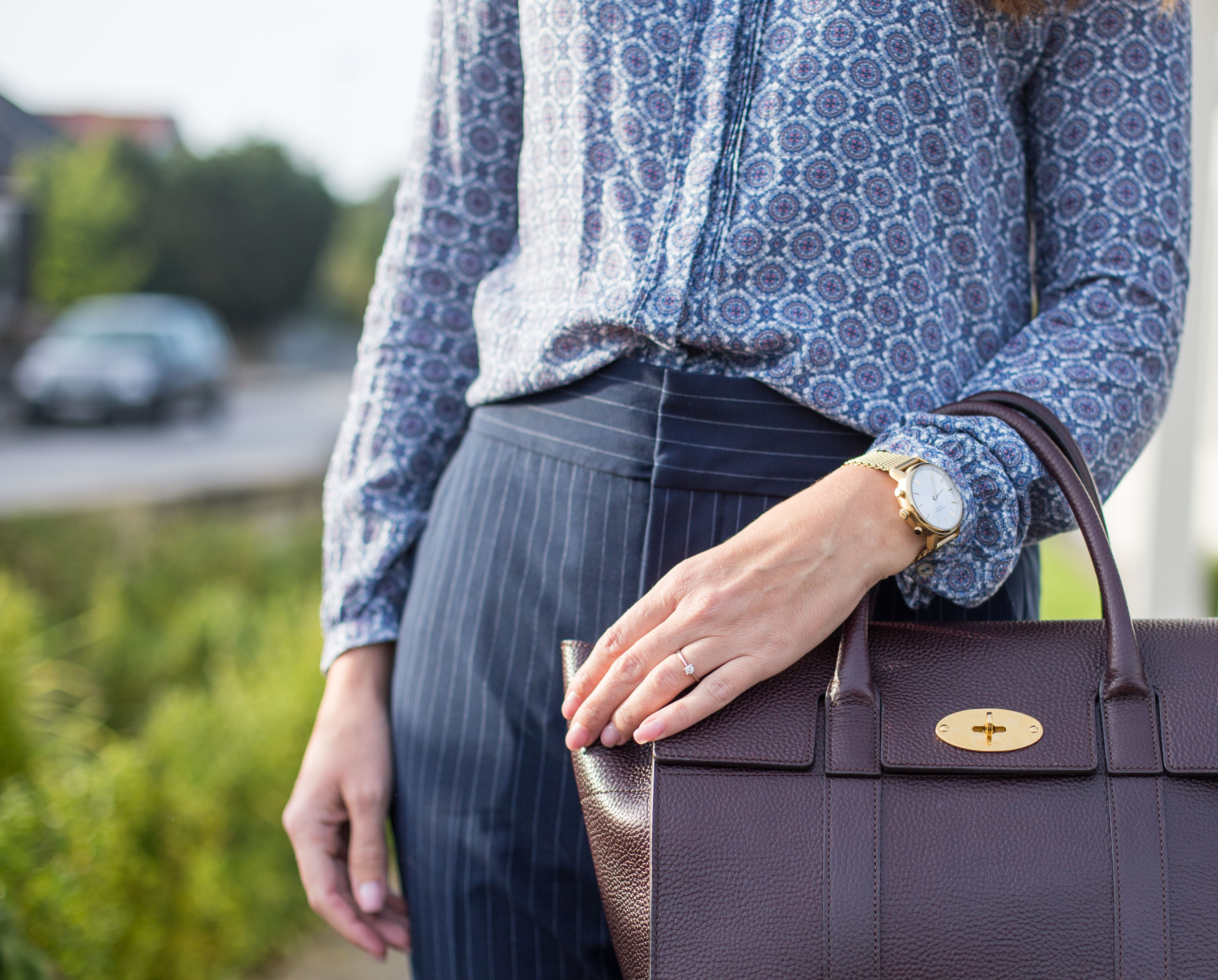
In this outfit i chose blue in different shades as a base and then I mixed stripes with floral pattern. As it is the same color as a base the contrast between the patterns won’t stand out as much as if I would go with different colors. Then I picked up the oxblood color in the blouse and used that color (in different shades) when adding details (the pumps and the bag).
This way the look is still modest even though I’ve mixed both patterns, fabrics and colors.

Some tips when mixing and matching:
The various patterns and colors don’t need to “match” each other, they just need to “go” together.
1.Work two different patterns and one base
Start with two different patterns in order for it to work for the office. To many different patterns might draw to much attention at the office. In my look I played with stripes and floral patterns and finished with plain/solid details.
2.Use varying scales of pattern
Pick one larger and one smaller pattern and one base with no patterns to work with.
3.Stick with a consistent hue
Within your color palette, use colors with consistent intensities. If your palette is pastel, don’t mix in a bold jewel tone and vice-versa. In this outfit I used different shades of blue and oxblood. Blue is a color used in business and is highly accepted, the twist that gives that little extra is the details in oxblood.
An alternativ is to use a single color, then play with different shades of the color. As long as you still vary the scale and type of pattern, you can create a very coherent look of mixed patterns this way. If the colors look good together, the prints will look good together too.

Photo by: Aleksjj
I’m wearing:
- Blouse, not available in store, similar
- Pumps, Zara
- Bag, Mulberry Bayswater
- Pants, Zara
– affiliate links